
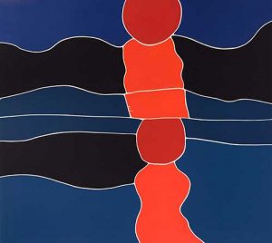
Sunrise, 1970
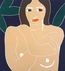
Nude, 1974
Philip Sutton
Woodcuts 1962-1976
22 May — 26 June 2021
The Philip Sutton Gallery
6a St. Michael’s Trading Estate
Foundry Lane
Bridport
Dorset DT6 3RR
Woodcuts
Philip Sutton has found a tree. This is an occurrence of significance to him and perhaps it makes him think of other special trees he has found. I remember him telling me about one he found as a young man.
Glad to be in the garden more often now that it is spring, he has become interested in a fig tree that grows from the other side of the garden wall. He tells me about how he looks at it and how he enjoys painting it. I can imagine him out there with his canvas and the first marks he makes on its surface. The simplicity of those marks as the tree’s shape appears could bring to mind the shapes cut out of wood in these prints he made in the 60’s and 70’s.
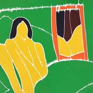
His playful way with shape can be seen in a uniquely clear way in these woodcuts. Colour seems instinctively to find harmony in Phil’s work and here the hues are arranged in so natural a way as you might see on a butterfly’s wing. The way a rose uncurls cut out in bold shapes. The woman with green hair and a red dress, the curves of her arms seem lively brought together on her lap. The sunrise reflected in a blue sea appears almost prehistoric in its wondrous simplicity.
Philip is excited to be showing this collection of woodcuts at his own gallery in Bridport. It was first exhibited as a collection in the early 2000s when it opened at the Royal Academy and then toured Britain.
With the days getting warmer, Phil will be able to spend more time looking at his tree and painting. Soon, as restrictions allow, I will be able to visit him again in his Dorset garden and talk with him about his tree and other interesting shapes he has found.
Rifka Allen Sutton, April 2021
Heather Cooke, 1969
The painter and his prints
Heather Sutton, 2005
In 1952, his last year at the Slade School of Art in London, Philip was welcomed to the etching room by John Buckland Wright. When Phil set to work chopping up large plates into dozens of small ones and covering the etching room tables, Buckland Wright encouraged him and cheerfully suggested that Phil enter for the Prix de Rome. The rest of the students in those days worked laboriously on single plates.
In the lithography room where they still used stones, Phil was under a very different regime. Lynton Lamb taught his craft as if he was dispensing a secret formula rather than providing a recipe.
Phil won a French painting scholarship in 1953 and went to Menton where he painted the orange trees surrounding his little house, one of these paintings being bought by the Tate Gallery. It was here that he made his first linocuts, Adam and Eve and other scenes from the Bible. Linocuts and woodcuts can be done very simply with a cutting instrument, a roller to ink up the wood or lino, and a spoon to transfer the ink to the paper.
The following spring he went to Paris to the Atelier 17, the famous studio run by the engraver S.W. Hayter. This had the advantage of being in a large workshop where the art printers were at one end and the commercial craftsmen were at the other, printing confirmation cards. There were no secrets there.
When Phil returned from France he discovered that he had lost a good friend. John Buckland Wright had died. Born in New Zealand, he was a professional artist who had lived on the Continent and had a broader, brighter more extravagant view of art than the home-grown English art teachers. He believed that painters made very good prints.
William Coldstream, the head of the Slade, offered Phil a job as a teaching assistant in etching and lithography and so Phil continued to print alongside the students. However, his style of teaching did not fit – he probably filled up too much table space. Instead he was given two days a week teaching in the painting department.
Coldstream’s recognition meant that when he introduced Phil to the Roland Browse and Delbanco Gallery in Cork Street, Phil was able to live as a professional painter. He had regular exhibitions at the gallery for the next 28 years.
A few years later Phil was asked to work with Stanley Jones making lithographs for the Curwen Press. One of the problems in lithography is that the colours are put on in layers and sometimes, if the colours is not registered properly, it overlaps at the edges. This was not a problem Phil experienced with woodblock printing where he was happy to experiment. By cutting up the woodblock, rolling up the block and printing each piece separately the colour was always clean, strong and saturated and never mixed on the paper. It allowed the artist to have as many different colours as there are pieces in the woodcut.
Over the years Philip has worked in the printing studios of very supportive friends, including the artists Stanley Jones, Ian Mortimer and Trevor Allen. The collaboration has always been a pleasure.
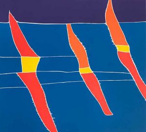
Boat Race, 1970
Philip Sutton: Printmaker
John Russell Taylor, 2005
It is not surprising that among his multifarious artistic activities, Philip Sutton should have tried his hand at print-making at various points in his career. He has worked in lithography and to a greater extent in woodcut, though until the present exhibition nobody – including possibly himself – had any idea of the scope of his output in the latter medium. The prints were, after all, made quite a long time ago. Many of the woodcuts in question date to a prolific period between 1967 and 1972 and most of them have never been shown in public since.
Sutton is, of course, unique. Exceptionally for an artist working at the beginning of the twenty-first century, he deals almost exclusively with the joys of life. For that matter, he always has done. The novelist and playwright David Storey, who was a contemporary of his at the Slade School of Fine Art in the early 1950s, remembers the first impact of Sutton’s work, when into this, at the time, rather grim institution, heavily under the influence of Bomberg and vowed to darkness and gloom, burst a show of Sutton’s art, offering a range of windows onto a happy sunny world beyond the walls. Sutton began as he meant to go on.
To suggest that Sutton is the artist-as-snail, carrying his whole world with him wherever he goes like a shell on his back, would seem to imply that he is very limited in his scope and ambitions. But nothing could be further from the truth: no doubt it all depends on the size of the shell. Sutton’s world-containing shell is extremely capacious. His scope is vast, he comprehends multitudes. He is active, extrovert, prolific: art pours from him with a Picasso-like abandon and unselfconsciousness. He does it with the speed and unselfconsciousness of someone who does not need to torment himself because he knows exactly what he is doing. Consequently, the most immediate characteristics of his work are brilliance and energy. He revels in all the colours of the rainbow. Whether a day or night scene, it is all the same to Sutton, as he can see or intuit as rich and varied a colouring by moon and stars as in the broad daylight. One feels he might well echo Turner, who, when interrogated by an irate lady who insisted that she could not see all the colours he found in the scene before them, replied, ‘No, madam, but don’t you wish you could!’ The inner eye has its reasons that the outer eye knows nothing of.
Sutton’s unbounded energy has always led him in numerous directions. He was ventured enthusiastically into sculpture (albeit always on a small scale), ceramics (or at least the decoration of, working in collaboration with a French potter friend), the playful application of painted patterns to hats, and, almost inevitably, the making of prints. His prints are frequently in stark black and white, reflecting the fact that, as well as being a true master of colour, he is a brilliant draughtsman, especially in the oriental manner where the rigidity of the pencil is replaced by the flexibility and fluidity of the brush.
Sutton’s best and most characteristic prints are the result of cutting patterns on wood. It is seldom woodcutting, let alone wood engraving, in the conventional sense of the term. Instead Sutton, who in his most intensive printmaking years around 1970 travelled extensively, as far afield as Fiji, carried with him fair-sized, albeit thin wooden boards, on which he would gouge out an image, to be printed on his return home. Many of the images from Fiji, both palm-dominated landscapes and portraits of family or even, improbably, of Albert Finney (whom he happened to meet out there) are in black and white, perversely disregarding any preconceptions one might have of working in a tropical paradise. But the heart of Sutton’s woodblock work lies in the colour prints. These are put together in a way which, though it is not wholly without precedent, he invented for himself. He would cut up the block into separate pieces, corresponding to the main colour areas of the image, then apply the relevant pigment to each piece individually before reassembling the jigsaw on the printed page. (Unbeknown to Sutton, André Derain did much the same with his Rabelais illustrations in the 1930s.) This ensures that the different colours remain perfectly discrete, perfectly pure. Once a colourist, always a colourist: in these delicious, almost edible-looking prints Sutton’s love affair with colour reaches one of its most satisfying consummations.
Sutton’s habitual brilliance of colour is closely bound up with his prodigious energy. William Blake observes in his Proverbs of Hell ‘Exuberance is beauty’, and Sutton would surely agree. His work is full of the force that through the green fuse drives the flower, bursting with sheer delight in all living things and perhaps even more so the potent delight of turning them into art. In these prints faces vie with flowers and foliage with water in a series of radical colour harmonies.
The prints have an air of spontaneity, as if the patches of rich pigments, so full-bodied that the fingertip can readily detect them planted on the smooth side of Sutton’s favoured Japanese Hosho paper, have somehow landed there of their own accord. But a moment’s consideration reveals the calculation beyond the superficial ease. The exquisitely precise finish of these prints is no accident, nor are the perfect colour harmonies, especially when achieved not in a quick watercolour sketch, which might just fall right, but during the relatively complex process of deconstructing and reconstructing an image in this intricate jigsaw fashion. Nor is the achieved result final. Sutton’s enquiring mind is quite ready to countenance extreme colour variations, changing the whole tone of the image from one printing to the next.
During the process of dissecting the original blocks, Sutton has also observed that when cutting them with an ordinary jigsaw, the upper surface remains immaculately clean and precise at the edges of the divisions. The lower surface, on the other hand is always chipped and splintered to some extent. It made Sutton wonder, what it would look like if he printed from the lower surface. Obviously, the image would be reversed and the edges would be jagged and indistinct instead of crisp and clear. He tried it and liked it. Which images he treated in this way seems to have been entirely a matter of instinct: we find portraits of family members, as well as several of a series he made in the early 1970s, loosely based on elements he liked in classic paintings by such artists as Velázquez and Manet. But Sutton also printed closely related images in the ordinary way – from the crisply finished front of the block – as though he was experimenting how far he could push a particular effect and what advantages, if any, doing so would afford.
It might also be thought that the effect of printing from the underside would be to modify the image further in the direction of abstraction. For it must be noted that in their bold simplifications of form, some of these prints, notably a series made from scenes in Falmouth harbour, are about as close as this passionately representational artist has come to genuine abstraction. In fact, a close check on the prints produced at this time indicates that the more evidently abstracted the subject – the Falmouth group resolve themselves almost entirely into areas of blue which we presume to be sea, and red, which we presume to be sails or their reflections – the more precise Sutton requires the finish to be.
Sutton’s prints, for so long virtually unregarded, offer a real treasure house of vivid experiences for the spectator. They also suggest various alternative directions Sutton might have taken. The bold areas of flat, uniformly applied colour suggest Pop Art in some respects. And while it may well look today as though Sutton was beating the classic Pop Artists at their own game, one can see also that this was not a direction in which he would wish to persist. The broad simplifications were not really for him, and his heart was much more in his own private world of realistic fantasy or magic realism than in the simplistic chic of Pop. If we are looking for comparisons rather than connections, they are not hard to find. On the one hand, the late paper cut-outs of Matisse immediately spring to mind, in their manipulation of boldly simplified areas of pure, vibrant colour. On the other, looking forward thirty years, we might find ourselves thinking of Gary Hume, who follows the same kind of simplifying convention and has the same kind of relish for creamy pastel shades, applied often to rather similar subjects.
With Sutton’s own subsequent work, the continuity is achieved through the presence in these prints of themes which will frequently recur in the later painting.
In general the prints serve to emphasise that throughout his career of fifty-odd years, Sutton, though naturally subject to fluctuations of style, like any artist working over such a long period of time, has kept the core of his mind and his works deeply – and inwardly – consistent. At the centre of that consistency is joy, pure joy in the act of making art. It shines out from all that Sutton does. He has grown into one of those happiest of men, whose work is the source of their most unalloyed pleasure and fulfilment.
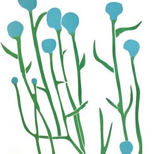
Cornflowers, 1968
View the catalogue here
See Photographs of the Exhibition
Phil talks about his work, May 2021
For further information contact: info@philipsuttonra.com
The Philip Sutton Gallery
6a St. Michael’s Trading Estate
Foundry Lane
Bridport
Dorset DT6 3RR